
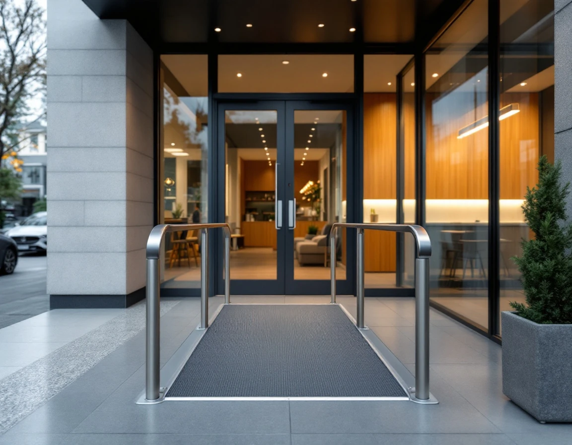
Why ADA Compliance for Sign Shops Matters
The Americans with Disabilities Act sets specific signage standards for every commercial building and public space in the United States. These aren't optional guidelines — they're federal legal requirements that apply to your clients' offices, retail stores, medical practices, and warehouses. Sign shops that understand ADA compliance for sign shops have a distinct competitive advantage over competitors who ignore these standards. When a business fails to meet federal ADA signage requirements, they face potential lawsuits, fines, and mandatory retrofits that cost far more than doing it right the first time.
Sign shops that understand ADA requirements have a distinct competitive advantage. While price-focused competitors rush through orders without considering compliance, you can position yourself as an accessibility advisor who protects clients from legal exposure. This expertise builds trust and wins contracts, especially with repeat commercial clients like property management companies, medical offices, and retail chains that need compliant signage across multiple locations.
Mastering ADA standards also protects your own business. When you deliver non-compliant signs, you share liability if a client faces an accessibility lawsuit. The number of ADA-related cases targeting small businesses has grown steadily over the past decade, making compliance knowledge both a risk management tool and a repeatable revenue generator. Clients will pay premium rates for shops that eliminate compliance uncertainty.
Five Key ADA Sign Compliance Standards
The Americans with Disabilities Act establishes five core technical standards for permanent signage in commercial and public buildings. These federal ADA signage requirements apply to room identification signs, restroom markers, exit indicators, and directional wayfinding throughout your clients' facilities. Understanding these standards allows your shop to deliver compliant work the first time and position yourself as an accessibility advisor rather than just a print vendor.
Tactile Characters and Raised Lettering
Permanent identification signs must include raised characters between 1/32 inch and 1/16 inch above the background surface. Users with visual impairments read these signs by touch, so the depth matters. The ICC/ANSI A117.1 standard specifies that characters must be uppercase, sans serif fonts, and between 5/8 inch and 2 inches tall depending on viewing distance. Test each sign with a depth gauge before installation to verify the raised lettering meets the minimum threshold.
High-Contrast Ratios Between Text and Background
Text and pictograms must contrast with their background by at least 70 percent when measured using the light reflectance value method. Dark text on a light background or light text on a dark background both work, but mid-tone combinations fail compliance testing. Your shop should maintain a contrast measurement tool or photometer to verify each design before production. This standard prevents signs from becoming illegible under varying light conditions or for clients with low vision.
Mounting Heights and Placement Standards
Wall-mounted identification signs must be positioned between 48 and 60 inches from the floor to the baseline of the tactile characters. The sign face must be located adjacent to the door on the latch side, and the entire sign must sit within 3 inches of the door frame. Overhead directional signs follow different rules, but room identification requires this precise placement so wheelchair users and people of varying heights can locate and read the information.
Grade 2 Braille Positioning
Braille must appear directly below the corresponding raised text, positioned between 3/8 inch and 1/2 inch below the lowest tactile character. Use contracted Grade 2 braille rather than uncontracted braille, as this is the standard most braille readers use daily. The dots must be domed or rounded, not flattened during production. Run your fingers across the braille to confirm each cell is distinct and readable before shipping the sign to your client.
Wayfinding and Room Identification Systems
Hallways, conference rooms, restrooms, stairwells, and exits all require permanent identification signs that meet the four standards above. Temporary signs for event spaces or changeable directories are exempt, but any permanent room designation falls under ADA accessibility requirements for business signs. Building a compliance checklist that covers character height, contrast ratio, mounting position, and braille placement helps your team audit every order and catch errors before installation.
Tactile and Braille Standards
Raised tactile characters must stand between 1/32 inch and 1/8 inch high, measured from the base surface. ADA requires sans-serif or simple serif fonts with consistent stroke width — decorative script or ornate lettering fails compliance. Sign shops should use routing equipment or molded processes that produce uniform character height across the entire sign, as hand-applied vinyl letters often create inconsistent depth.
Braille must appear directly below the corresponding raised text, typically 3/8 inch beneath the baseline. The two systems work together: raised letters serve low-vision readers, while Grade 2 braille — the contracted version that abbreviates common words — serves blind readers. Grade 1 braille spells every word letter-by-letter and is reserved for technical terms or proper names. Most permanent signage uses Grade 2 because it reads faster and occupies less space.
Compliant signs use non-glare materials like matte-finish acrylic or brushed metal that won't create reflective hotspots under overhead lighting. Photopolymer molding and CNC routing both produce durable, consistent results when calibrated correctly. Signs printed on glossy substrates or assembled with separate braille inserts placed above or beside the text fail inspection and expose your client to complaints.
Contrast Ratios and Visual Clarity
Federal ADA signage requirements demand a luminance contrast ratio between tactile characters and their background that meets legibility standards for individuals with low vision. Black text on a white background delivers the strongest possible contrast, while dark blue on black falls short of the compliance threshold.
Sign shops can verify contrast using free online WCAG contrast checkers or dedicated tools like the Colour Contrast Analyser. Input the hexadecimal color codes for your text and background, and the tool calculates the luminance ratio instantly. Include contrast test results in client proposals to demonstrate compliance before production begins, especially when clients request brand colors that may not meet standards.
Material finish affects contrast performance as much as color choice. Glossy surfaces create glare that reduces effective contrast under certain lighting conditions, while matte finishes maintain consistent readability. When a client's brand palette lacks sufficient contrast, recommend adjusting shade values or selecting a compliant alternative for ADA-required signage while preserving brand colors for decorative elements.
Common Compliance Mistakes Sign Shops See
Walk into any commercial building and you'll likely spot at least one ADA signage violation. The mistakes follow predictable patterns, and understanding them helps sign shops educate clients before problems arise.
- Braille placement errors top the list. Many sign shops mount braille inserts wherever they fit visually rather than directly below the raised text. When braille sits to the side, above, or more than 3/8 inch below the raised characters, visually impaired users can't reliably locate it. This happens when designers prioritize aesthetics over the technical standard, or when installers receive incomplete specifications.
- Contrast ratio failures create another frequent issue. A navy-blue background with gray text may look professional in concept sketches, but it often measures below the 70% luminance requirement. Sign shops that rely on visual judgment rather than contrast measurement tools deliver signs that fail inspection. The problem intensifies with glossy finishes that create glare hot spots.
- Mounting height violations occur when installers don't measure from the floor to the sign's centerline. A sign mounted at eye level for standing adults often sits too high for wheelchair users. The 48-to-60-inch range accounts for both wheelchair approach and standing visibility, but rushed installations skip this verification step.
- Wayfinding inconsistency compounds these individual errors. When different buildings in a campus use varied sign formats, mounting positions, or braille styles, visually impaired visitors lose the pattern recognition that makes navigation possible. Sign shops that document and replicate exact specifications across multiple locations help clients maintain accessibility standards that actually function in practice.
Auditing Your Shop and Client Signs
The best way to master ADA compliance for sign shops is to start with your own facility. Walk through your shop's entrance, office areas, and restrooms with a measuring tape and camera. Document the height of every room identification sign, photograph the contrast between text and background, and verify that tactile characters sit between 48 and 60 inches from the floor. This hands-on audit trains your eye to spot violations and builds confidence before you evaluate client work.
When a client requests a quote for office signage or wayfinding systems, ask for photos of their existing signs and floor plans showing door locations. Review each image for contrast issues, missing braille, or improper mounting. This pre-quote evaluation allows you to identify compliance gaps, educate the client about federal requirements, and position your shop as an accessibility advisor rather than just a fabricator. Clients who understand the liability risks will pay for compliance verification as part of your service.
Invest in three essential tools: a digital measuring tape for precise height verification, a contrast analyzer app or colorimeter to test luminance ratios, and printed copies of the ADA Standards for Accessible Design sections 703.2 through 703.5. The Colour Contrast Analyser from TPGi is free software that calculates contrast ratios from photographs. Mount height verification requires only a tape measure, but bring a level to confirm signs sit parallel to the floor. Keep reference documents in your vehicle so you can audit client sites during initial consultations.
Document every measurement and photograph each sign from straight-on and at wheelchair eye level. Create a simple compliance checklist with fields for contrast ratio, tactile character height, braille placement, mounting height, and finish type. Have clients sign off on audit reports before you begin fabrication. This paper trail protects your shop if a building owner later faces an access complaint, and it demonstrates due diligence that generic sign vendors cannot match.

Positioning ADA Expertise as a Service
Sign shops that master ADA compliance for sign shops can transform regulatory knowledge into a competitive advantage by offering compliance audits and consulting as premium services. Start by incorporating your ADA expertise into every client conversation — when a property manager requests room identification signs, explain how compliant installations protect them from Department of Justice complaints and private accessibility lawsuits. Use your website to position your shop as an accessibility partner, not just a sign vendor, with case study pages showing how your compliance guidance helped clients pass facility inspections or avoid costly retrofits.
Bundle an ADA compliance audit with large signage projects for hospitals, office buildings, and municipal facilities. Walk the site with a measuring tape and contrast analyzer, document existing violations, and deliver a written report identifying which signs need replacement or repositioning. This service appeals directly to risk-averse facility directors and property managers who recognize that a preventive audit is far more cost-effective than defending against an ADA lawsuit.
Create a downloadable sign shop ADA compliance checklist as a lead magnet on your website to capture inquiries from local businesses planning renovations or new construction. The checklist should cover the five core requirements — raised characters, braille placement, contrast ratios, mounting heights, and wayfinding consistency — and position your shop as the trusted partner who can execute compliant installations from the first quote.
Before offering this service to clients, audit your own facility first. Measure your restroom signs, verify your office door braille, and test your lobby wayfinding contrast ratios. This hands-on practice builds the credibility you need to guide clients confidently and win contracts from competitors who treat ADA standards as optional details rather than how to make signs ADA compliant specifications.