
Multi-Service Retail Layout Challenge
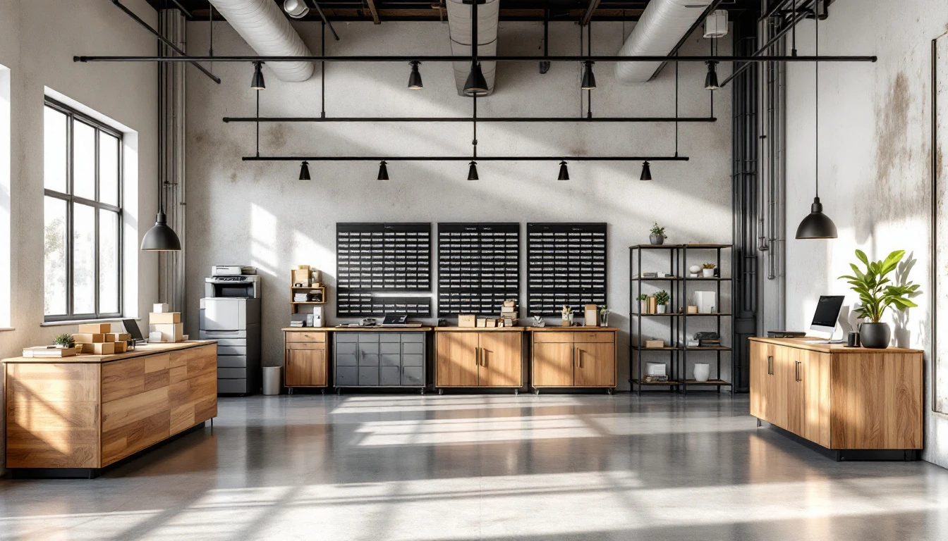
Walk into most pack-and-ship stores and you'll find the shipping counter along one wall, mailboxes clustered near the entrance, printing equipment tucked in the back, and notary services squeezed wherever space allows. These layouts rarely reflect deliberate planning. Instead, they inherit patterns from previous tenants, follow equipment placement logic (printers need ventilation, postal scales need power), or simply group services based on what felt right when the owner signed the lease. Store layout optimization that improves customer flow, however, demands more than intuition.
The problem is that intuition-based layouts leave serious money on the table. When shipping desks sit isolated from mailbox zones, customers renting mailboxes rarely discover that you offer packaging supplies or international shipping. When printing stations hide in the back corner, walk-in customers scanning documents never see your notary sign-in sheet. Service isolation actively suppresses cross-service discovery. Costing small retailers between 15 and 30 percent in potential revenue.
Manual observation can't capture what matters. Standing behind the counter during your Tuesday afternoon shift won't reveal traffic velocity patterns across the week, dwell time variations by service type, or the sequence in which customers move between zones. Your POS system already tracks these patterns with every transaction. July offers the perfect window to extract that data, audit your layout, and make adjustments before holiday demand arrives in October. The entire process costs under $500 in labor and compounds efficiency gains throughout your busiest quarter.
POS Data: Four Key Layout Metrics
Your POS system already captures the four metrics that reveal how customers move through your store and which service combinations drive revenue. These aren't abstract analytics requiring specialized hardware—they're transaction patterns embedded in the data your system records every day.
- Dwell time per zone measures how long customers spend at each service counter. When printing customers linger for twelve minutes but shipping transactions average four, you've identified which services create opportunities for conversation and add-on sales. Pair high-dwell services with impulse products or complementary offerings.
- Transaction sequence frequency tracks which services customers purchase together during a single visit. If your data shows that thirty percent of notary customers also ship documents the same day, adjacency matters. Placing notary near your shipping counter eliminates the friction of crossing the store twice and increases the likelihood customers will use both services.
- Basket size by zone pairing reveals the revenue impact of service proximity. Run a simple query comparing average transaction values when customers use adjacent services versus separated ones. If customers who print and ship together spend more than those who only ship, your layout should encourage that combination.
- Peak-hour traffic velocity identifies congestion points that kill conversions. When your Tuesday lunch rush creates a bottleneck at the mailbox wall that blocks access to printing, you lose sales. Export hourly transaction timestamps for your busiest days, map them against service locations, and you'll spot where foot traffic patterns create customer friction.
Most integrated POS systems let you export this data in an afternoon. Filter transactions by service type, sort by timestamp, and look for patterns. The layout changes these metrics suggest—moving a counter three feet, rotating a display, clearing a sightline—cost little but compound throughout the year.
Extracting Layout Data from Your POS
Your POS system already tracks where customers spend their time—you just need to know where to look. Most integrated systems like ParcelPuffin capture transaction data tagged by service zone and timestamp. The key is exporting this data in a format you can analyze. Start by requesting a transaction history export that includes service type, transaction time, and customer ID. Most modern POS platforms generate this as a CSV file, which opens in Excel or Google Sheets.
Once you have the raw data, filter transactions by service zone and time of day. Look for patterns: do customers who print documents between 9 and 11 a.m. also visit the shipping counter? Calculate adjacency ROI by cross-tabulating service pairs. If 40 percent of customers who enter the shipping zone within ten minutes also visit the printing zone, place them within fifteen feet. This simple calculation reveals which services naturally complement each other and which are operating in isolation.
Next, calculate average dwell time by dividing total transaction minutes per zone by the number of transactions in that zone during peak hours. A printing zone that processes twenty transactions in an hour with an average of four minutes per transaction tells you how much floor space and counter length that service actually needs. Compare this against quiet zones during the same period—if your notary station sits idle for three hours every morning, it's consuming real estate that could serve higher-traffic services.
This analysis takes one to two hours and should be repeated quarterly. ParcelPuffin users can request zone-level reports directly from the dashboard without manual data manipulation. The goal is identifying congestion points where customers queue unnecessarily and quiet zones that could relocate to lower-traffic areas, freeing premium space for services that drive cross-purchases.
Low-Cost Layout Adjustments
Once you've identified service pairs that transact together frequently, translate that data into physical changes. The goal is to reduce the distance customers travel between complementary zones, making it easier for them to add services without feeling like they're navigating a maze. Zone proximity in retail store layout design shapes how customers discover and use your services: moving high-correlation service pairs within 12 to 20 feet triggers impulse cross-purchases because customers can see and access both zones during a single visit.
One Chicago pack-and-ship operator moved the notary desk 10 feet closer to the mailbox counter after POS data revealed a strong overlap between notary customers and active mailbox renters. Notary transactions picked up within six weeks as mailbox customers discovered the notary desk during their routine visits. This required no renovation—just repositioning existing furniture and updating directional signage.
Use visual boundaries to define zones without construction. Floor tape, hanging banners, or repositioned shelving units create clear pathways that guide customers from one service to another. If printing queues during lunch hours create bottlenecks that push customers away from shipping, add a second printing station near the entrance or place a digital queue display between the printing and shipping zones. This retains customers during handoffs and reduces perceived wait time.
Staffing adjacency extends your team's reach. Position complementary service zones so one employee can monitor both during slow periods, reducing idle wait time and allowing faster service during unexpected rushes. A store that reduced peak-hour congestion by three minutes per customer saw 20% faster throughput, turning away fewer walk-ins during busy periods.

Measuring Layout Success Post-Implementation
Layout changes don't produce instant results. Customers need four to eight weeks to discover new zone placements, adjust their browsing patterns, and build new service habits. During this maturation period, your POS system captures the metrics that reveal whether your changes are working.
Start by tracking dwell time per customer and multi-service basket size monthly for ninety days after your layout adjustment. Pull transaction data the same way you analyzed it during your initial audit. You're looking for dwell time to increase by three to five minutes and basket size to grow by eight to twelve percent. These improvements signal that customers are discovering and adopting services they previously overlooked.
Create a simple dashboard in Google Sheets to track progress. Include columns for revenue per customer, cross-service adoption rate (what percentage of shipping customers also use notary or printing), and peak-hour transaction velocity. Benchmark these numbers against your pre-change baseline. The July-through-October window offers prime testing ground—you can refine your layout before holiday volume arrives in November.
Monitor peak-hour congestion metrics weekly during the first month. If queue times spike or checkout velocity drops, revert the change quickly and test a different adjustment. Not every hypothesis works, and catching problems early prevents compounding losses.
Plan quarterly audits in July, October, and January to catch seasonal shifts and repeat the optimization cycle as customer behavior evolves.
Real-World Store Layout Optimization and Customer Flow Outcomes
"The fifteen-to-thirty percent uplift cited in POS-driven layout optimization isn't aspirational—it's rooted in real-world results. A five-service retailer in Portland moved their notary desk eight feet from a back corner to the main customer floor. Notary revenue climbed measurably within twelve weeks. The reason? Mailbox customers and shipping traffic could now see the notary service during their visit, turning what was once invisible into an obvious add-on."
Case data shows that adjacent shipping and printing zones increase cross-service adoption by twenty-two percent on average. When customers standing at the counter to print documents see shipping supplies within arm's reach, they're more likely to realize they can handle both errands in one stop. Notary services placed in customer-facing zones boost notary dwell time by forty percent and monthly revenue by $800 to $1,200 compared to back-office placements. Mailbox-to-shipping adjacency reduces customer abandon rate by twelve percent because customers recognize bundled value before they leave.
Q4 seasonal demand—gift wrapping, holiday mailing, extended hours—compounds these gains when implemented by mid-July. Layout efficiency reduces friction during peak season. Allowing staff to serve fifteen to twenty percent more customers per hour without hiring. A well-positioned gift-wrap station near shipping during November and December turns single-service transactions into multi-service baskets.
These outcomes require both data analysis and quick action. Layout changes implemented by August first have time to mature before September back-to-school volume tests the new flow. Miss that window, and you're troubleshooting congestion during your busiest weeks instead of capitalizing on improved throughput.